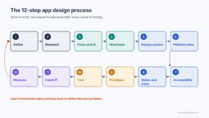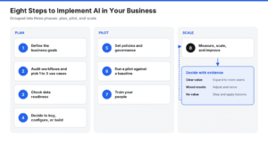
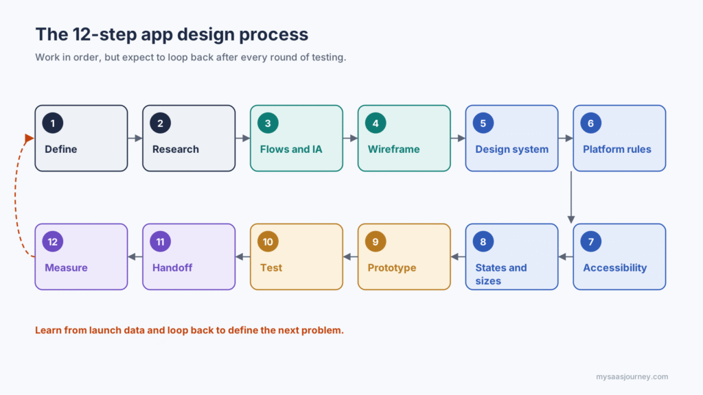

How to design an app, in short: Define the problem and the people you are solving it for, research their needs, map the screens and user flows, sketch and wireframe the layouts, build a design system of reusable tokens and components, apply iOS, Android, and accessibility guidelines, prototype and test with real users, then hand developers a specification they can build from and keep improving after launch.
Those steps sound linear, but good app design loops. You will sketch, test, and rework several times before a single screen is final. What separates apps that feel effortless from apps that frustrate people is rarely visual polish. It is clear thinking about the problem, consistent patterns, and design decisions that developers can translate into code without guessing.
This guide walks through twelve steps with the technical depth that most “how to design an app” articles skip. You will see how design tokens become code, how to check color contrast programmatically, how the same button spec maps to SwiftUI and Jetpack Compose, and how to plan analytics events before launch. It also covers the platform changes that shape app design in 2027, including Apple’s Liquid Glass design language, Google’s Material 3 Expressive update, and the European Accessibility Act, which has applied to many consumer apps sold in the EU since June 28, 2025. The guide is vendor-neutral and written for founders, product managers, designers, and developers designing their first or next app.
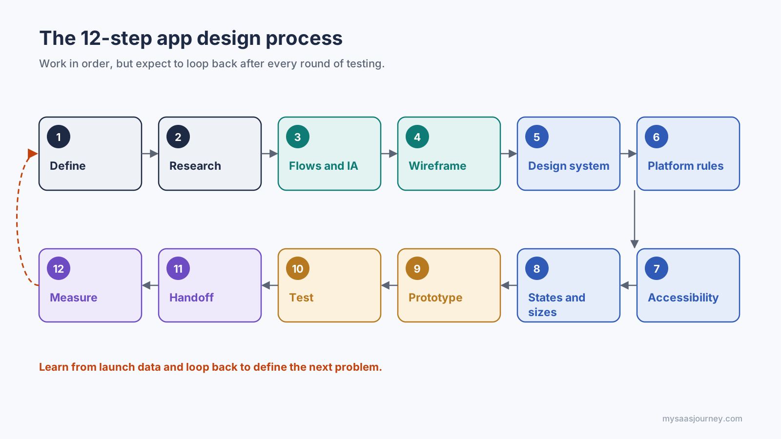
Work in order, but expect to loop back after every round of testing.
What Does App Design Include?
App design covers everything that decides how an app works and feels for the person using it, from the problem it solves down to the color of a button. It is usually split into three overlapping disciplines.
- User experience (UX) design: The structure and logic of the app. UX covers research, user flows, navigation, information architecture, and how easily people complete their tasks.
- User interface (UI) design: The visual layer. UI covers layout, typography, color, iconography, spacing, and the look of every component.
- Interaction design: How the app responds to input. It covers gestures, transitions, feedback, animation, and the states each element moves through.
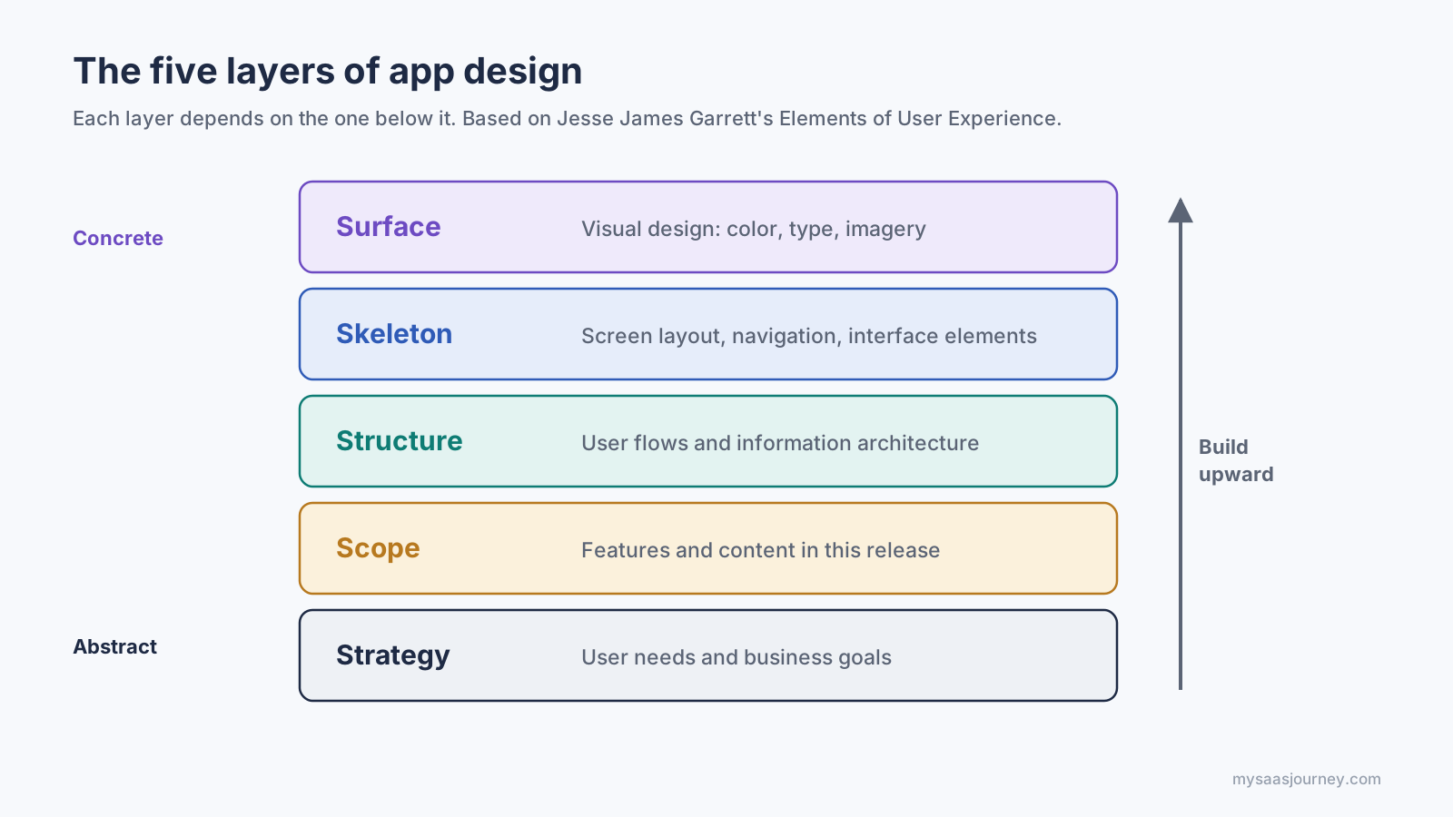
A helpful way to see how these fit together is the five-layer model from Jesse James Garrett’s book The Elements of User Experience. Each layer depends on the one beneath it, so you work from the bottom up:
- Strategy: What the business wants and what users need.
- Scope: Which features and content the app will include.
- Structure: How screens connect and how information is organized.
- Skeleton: The layout of each screen, navigation, and interface elements.
- Surface: The visual design people actually see.
Build from strategy up to surface, not the other way around.
Most failed app designs skip the lower layers and start at the surface. A beautiful screen built on an unclear strategy or a confusing structure still produces a confusing app. The twelve steps in this guide follow the same bottom-up order.
Step 1: Define the Problem, Users, and Goals
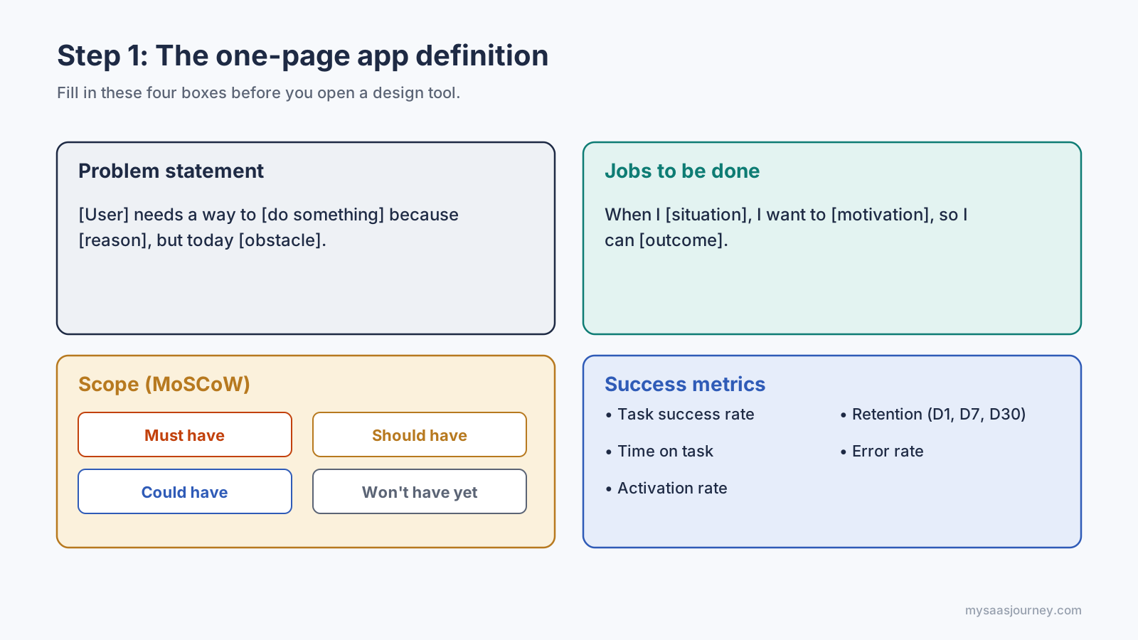
Start by writing down the problem your app solves, who has it, and how you will know the design works. Every later decision, from navigation to button labels, should trace back to these answers.
Write a Problem Statement
A problem statement keeps the team focused on a user need rather than a feature list. A simple template works well:
[Type of user] needs a way to [do something] because [reason], but today [current obstacle].
If you cannot fill in the obstacle, you may not have a problem worth designing for yet.
Describe Your Users and Their Jobs
Create one to three lightweight personas, or better, describe the “jobs” users hire your app to do. A job statement focuses on the situation and outcome, not demographics: “When I [situation], I want to [motivation], so I can [outcome].” Jobs are easier to test than personas because they describe behavior you can observe.
Set the Scope
List every feature idea, then sort them into must-have, should-have, could-have, and will-not-have for the first release. This method, often called MoSCoW, protects your first version from feature creep. The must-have list becomes your minimum viable product (MVP), the smallest version that still solves the core problem.
Choose Success Metrics
Decide upfront how you will measure the design. Useful app design metrics include:
- Task success rate: The share of users who complete a key task without help.
- Time on task: How long the key task takes.
- Activation rate: The share of new users who reach the moment the app first delivers value.
- Retention: The share of users who return after one day, seven days, and thirty days.
- Error rate: How often users take a wrong path or hit an error message.
Write these four outputs (problem statement, jobs, scope, and metrics) on a single page. If you plan the project in a spreadsheet, a project plan template can hold the timeline and owners alongside them.
Fill in these four boxes before you open a design tool.
Step 2: Research Users and Competitors
Research tests your assumptions before you spend time on screens. A week of focused research often saves months of redesign, because it shows you what people actually do rather than what you hope they do.
Talk to Potential Users
Run five to ten short interviews with people who match your target users. Ask about their last real experience with the problem, not about your idea. Questions such as “Tell me about the last time you tried to do this” and “What did you use, and what was frustrating?” produce concrete stories. Avoid questions like “Would you use an app that does X?” because people are poor at predicting their own behavior.
Use Quantitative Signals Where You Can
Interviews tell you why people struggle. Numbers tell you how many people share that struggle. Short surveys, app store review mining, search volume for the problem, and analytics from an existing product or website all help you size each need. Look for patterns that show up in both interviews and numbers.
Run a Competitor Teardown
Install the three to five apps your users already rely on, including indirect alternatives such as spreadsheets or paper. For each one, record:
- The onboarding steps and how long it takes to reach value.
- The primary navigation pattern and the number of top-level sections.
- How it handles the key task you plan to support.
- What reviewers praise and complain about most often.
- Accessibility basics, such as text resizing and screen reader labels.
A teardown is not about copying. It shows you the conventions users already know, which you should usually follow, and the gaps you can design around.
Synthesize Before You Design
Group your notes into themes on a shared board. Sticky-note clustering, often called affinity mapping, turns dozens of observations into a handful of clear needs. An online whiteboard makes this easier for remote teams. Finish with a short list of design principles, such as “one-handed use on the move” or “never lose a draft,” that you will use to judge later decisions.
Step 3: Map User Flows and Information Architecture
Before you draw a single screen, map the paths people take through the app and decide how content is organized. This is the structure layer, and it is far cheaper to fix in a diagram than in a finished design.
Map Your Core User Flows
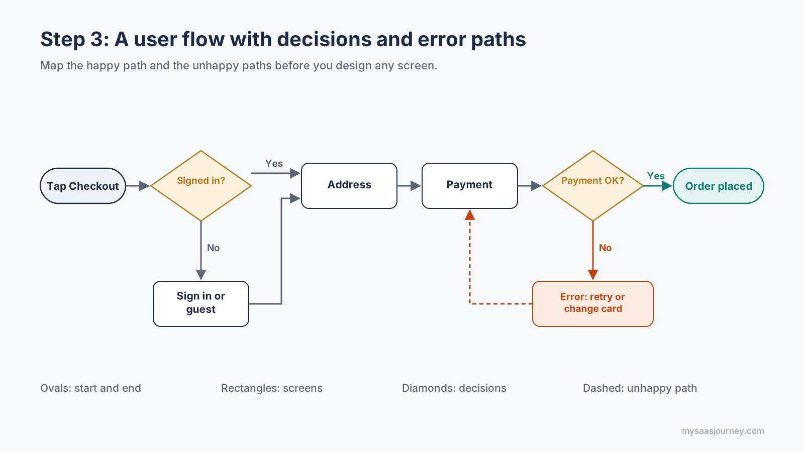
A user flow shows every step a person takes to complete one task, including decisions and error paths. Start with the two or three flows that matter most, such as sign-up, the main task, and payment. Use simple shapes:
- Ovals for the entry and end points.
- Rectangles for screens.
- Diamonds for decisions, such as “Is the user signed in?”
- Arrows for the direction of travel, labeled with the action that moves the user forward.
Count the steps in each flow. Every screen and every tap you remove from a core flow raises the share of people who finish it. Also map the unhappy paths: a failed payment, a lost connection, or an expired session. These are the moments users remember.
Map the unhappy paths as carefully as the happy one.
Organize Content With Information Architecture
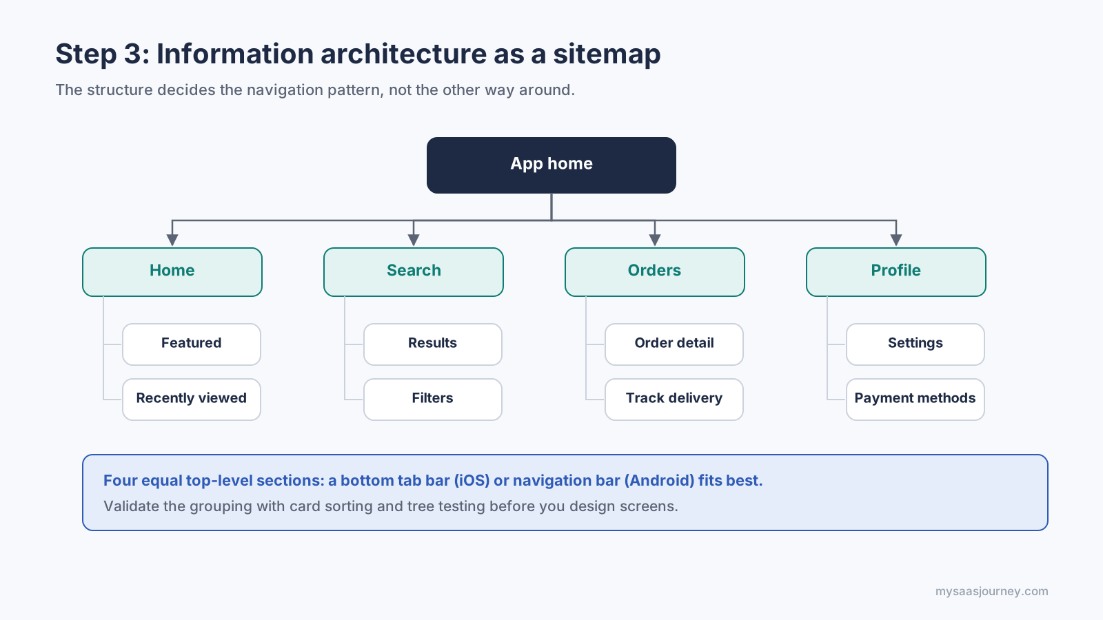
Information architecture (IA) is the way screens and content are grouped, labeled, and connected. The output is usually a sitemap that shows every screen in a tree. Two research methods help you get it right:
- Card sorting: Users group topics into categories that make sense to them, which shows you their mental model.
- Tree testing: Users try to find items in your proposed structure using text labels only, which shows where the structure fails before any visual design exists.
A sitemap shows how many top-level sections you have, which decides the navigation pattern.
Choose a Navigation Pattern
Your IA decides which navigation pattern fits. The most common mobile patterns are:
| Pattern | Best for | Watch out for |
| Tab bar (iOS) or navigation bar (Android) | Three to five equally important top-level sections | Hiding a key section in a sixth “More” tab |
| Navigation drawer | Many sections, some used rarely | Lower discoverability, because options are hidden |
| Hierarchical (stack) navigation | Drilling from a list into detail screens | Deep stacks that make users lose their place |
| Modal screens | Short, focused tasks such as composing or editing | Using modals for content people need to compare |
| Single-screen with sheets | Simple utilities and map-based apps | Overloading one screen with too many controls |
Keep labels short and literal. A tab called “Orders” beats a clever name, because people scan navigation rather than read it.
Step 4: Sketch and Wireframe Your Screens
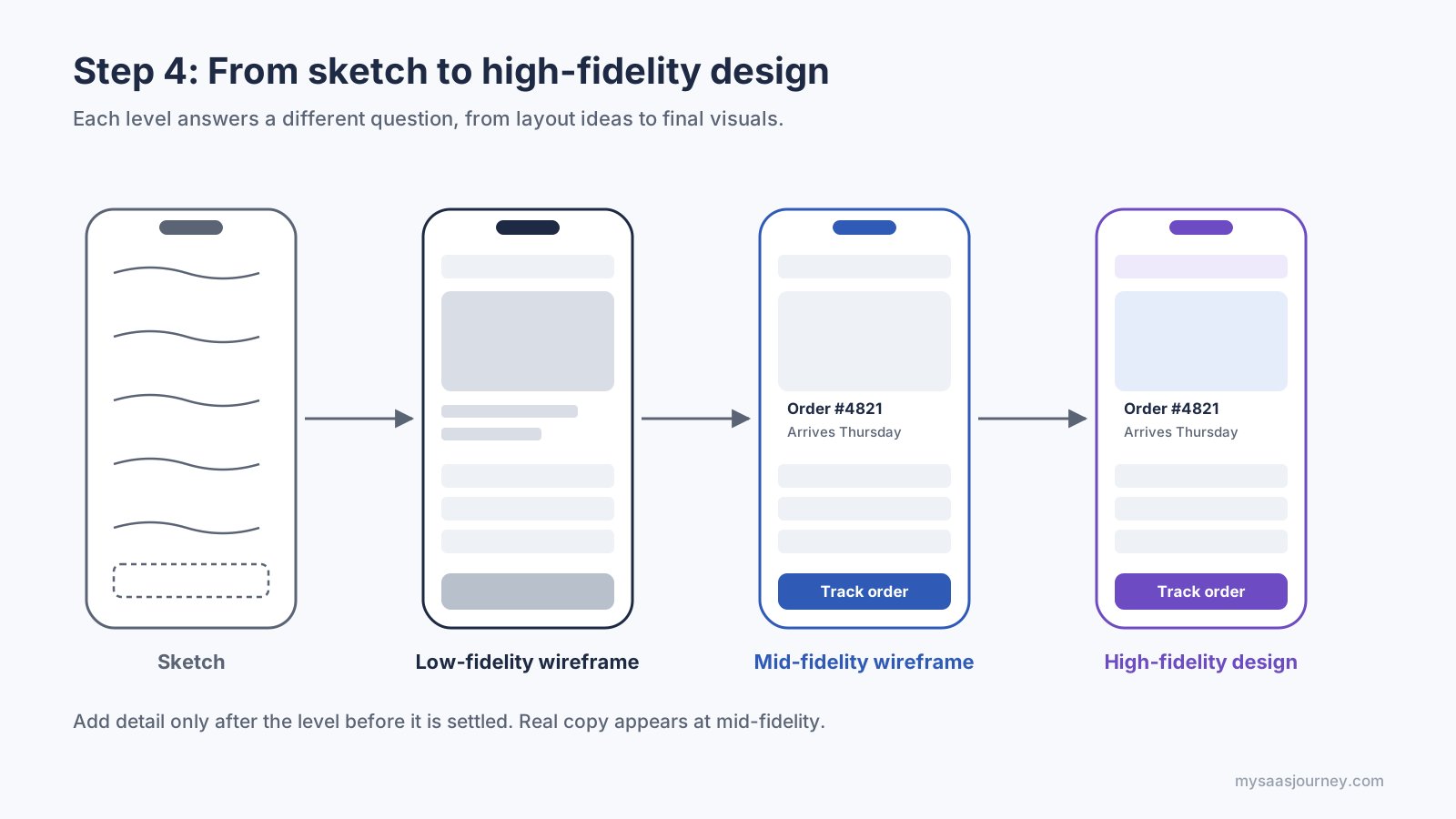
Wireframes turn your flows into screen layouts without visual styling, so the team can debate structure instead of colors. Move through three levels of fidelity, and only add detail once the level below is settled.
| Fidelity | What it contains | Purpose | Typical time per screen |
| Sketch | Boxes and lines on paper or a whiteboard | Explore many layout ideas quickly | Minutes |
| Low-fidelity wireframe | Grayscale boxes, placeholder text, basic hierarchy | Agree on content and layout | Under an hour |
| Mid-fidelity wireframe | Real copy, spacing on a grid, component placeholders | Test flows and hand off structure | A few hours |
Add detail only after the level before it is settled.
Sketch Several Options First
For each key screen, sketch three to five different layouts before choosing one. A common exercise is to fold a sheet of paper into eight panels and draw one idea in each, which forces you past the first obvious answer. Keep sketches rough on purpose. Nobody gets attached to a pencil drawing.
Lay Out on a Grid
Move promising sketches into a design tool and place them on a layout grid. Most mobile layouts use a 4-column grid with 16-point side margins on phones, widening to 8 or 12 columns on tablets. Pair the grid with an 8-point spacing system, where every margin, padding, and gap is a multiple of 8 (with 4 for fine adjustments). A consistent spacing scale makes screens feel ordered and makes developer handoff simpler, because there are only a few values to implement.
A grid, a spacing scale, and the thumb zone guide every layout decision.
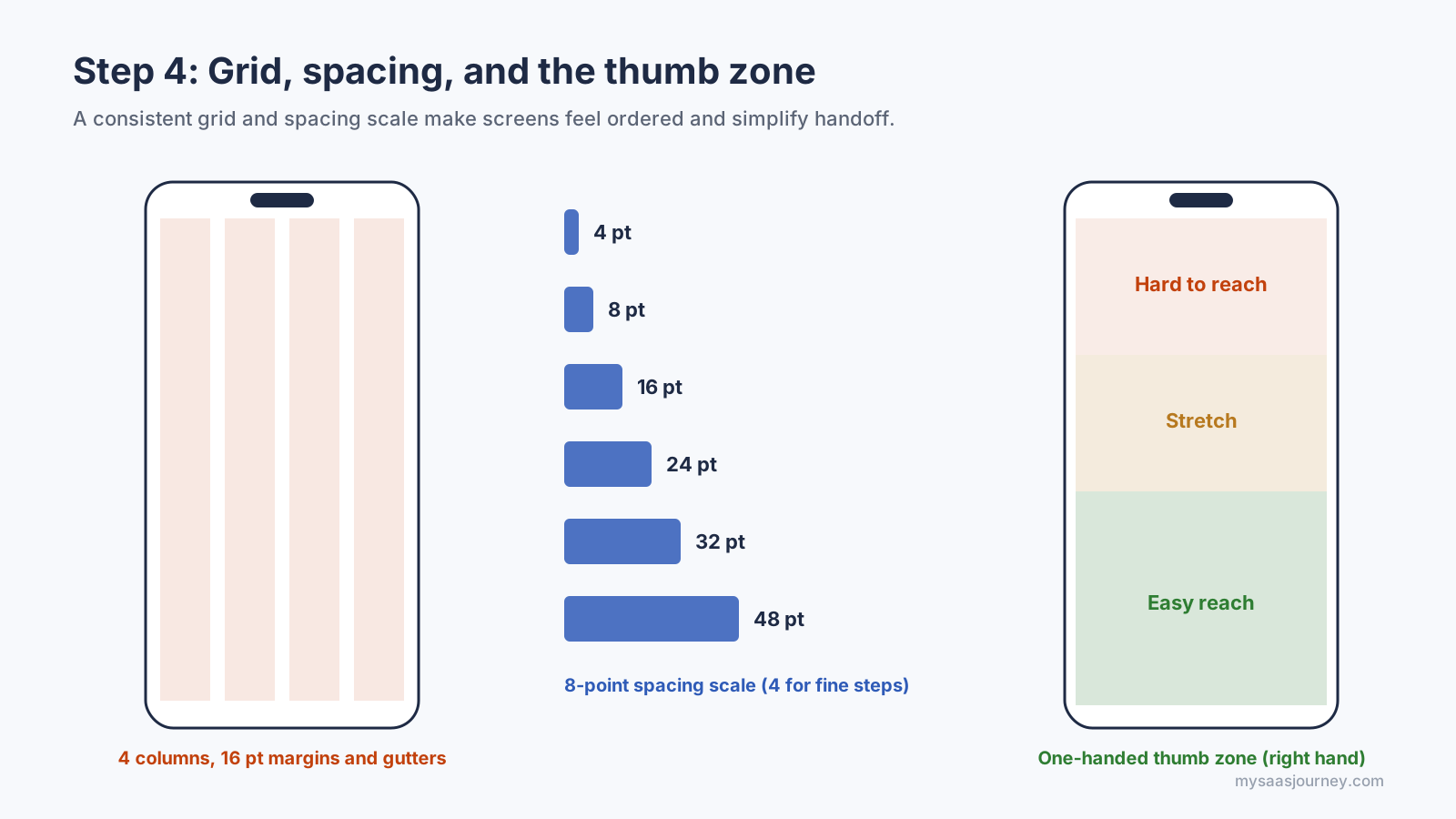
Design for Thumbs
Most people use a phone with one hand, so the bottom half of the screen is the easiest area to reach. Place primary actions and navigation within thumb reach, and keep destructive or rarely used actions out of the easiest-to-hit spots. On large phones, avoid putting the only way to complete a task in the top corners.
Write Real Copy Early
Replace placeholder text with realistic content as soon as possible. Real names, prices, error messages, and long translations expose layout problems that “Lorem ipsum” hides. Write button labels as verbs that describe the result, such as “Save draft” or “Pay $24.00,” rather than generic words like “OK” or “Submit.”
Step 5: Build a Design System With Tokens and Components
A design system is the set of reusable decisions, such as colors, type sizes, spacing, and components, that keeps every screen consistent. Even a small app benefits from one, because it turns hundreds of one-off choices into a short list you can change in one place.
Start With Design Tokens
Design tokens are named values that store your visual decisions in a format both designers and developers can use. Most teams organize them in three tiers:
- Primitive tokens hold raw values, such as blue-600 = #2563EB.
- Semantic tokens describe purpose, such as color-action-primary = blue-600.
- Component tokens apply to one component, such as button-primary-background = color-action-primary.
Three tiers of tokens keep every design decision in one place.
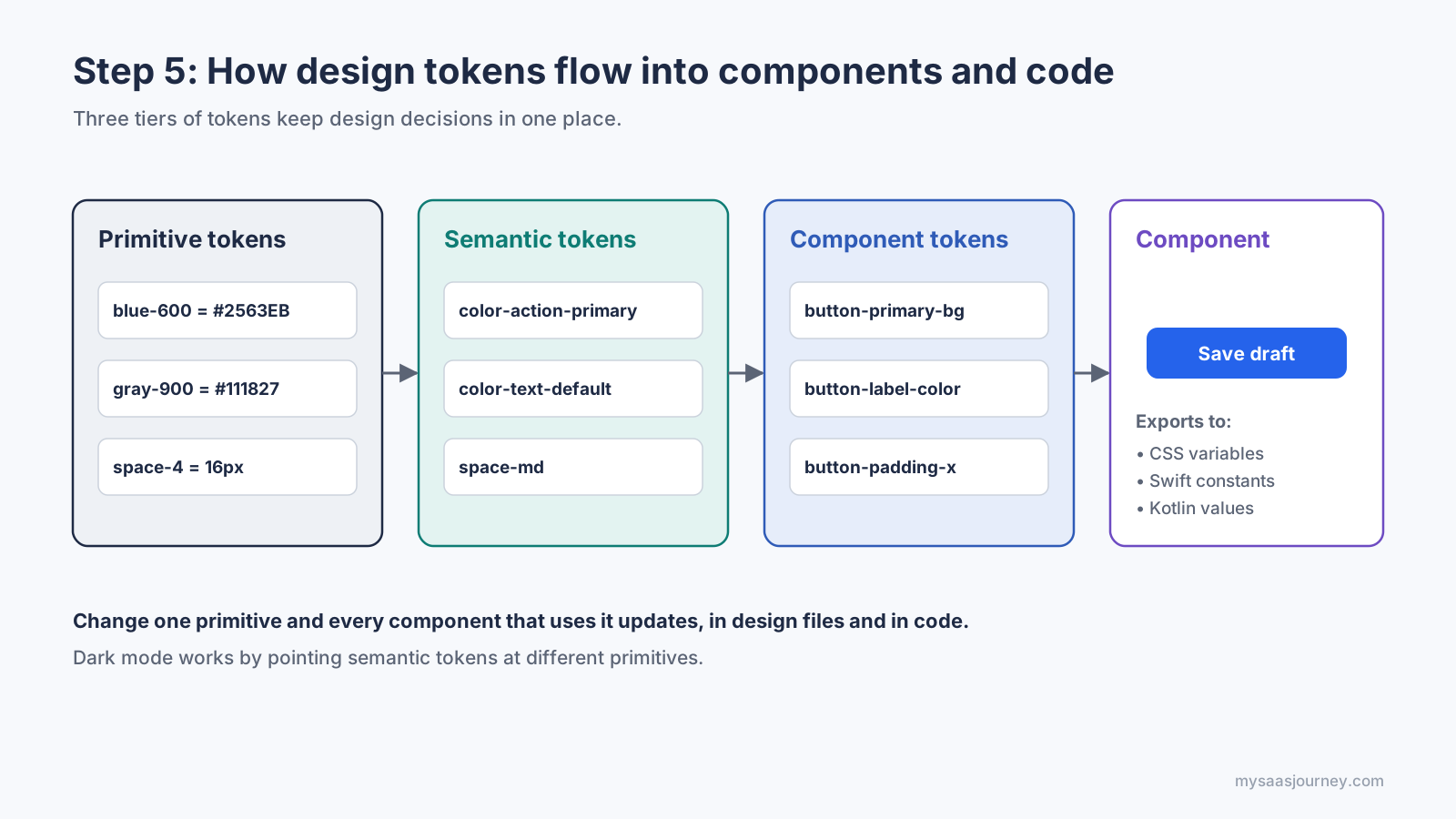
The semantic tier is what makes theming possible. To build dark mode or a new brand, you point semantic tokens at different primitives, and every component updates. Here is a small token file in a JSON format based on the W3C Design Tokens Community Group specification:
A build tool such as Style Dictionary can transform that one file into CSS variables for web, Swift constants for iOS, and Kotlin values for Android. The CSS output looks like this:
Define a Type Scale
Pick one or two typefaces and a small set of sizes with clear roles: display, title, headline, body, and caption. On mobile, body text is usually 16 to 17 points. Use a consistent ratio between sizes, and set line height to roughly 1.3 to 1.5 times the font size for body text. On iOS, map your styles to Dynamic Type text styles, and on Android use scalable sp units, so text grows when users increase their system font size.
Build Components With Every State
Components are reusable building blocks such as buttons, inputs, cards, lists, and dialogs. Design every state a component can be in, not just the default:
| Component | States to design |
| Button | Default, pressed, focused, disabled, loading |
| Text input | Empty, focused, filled, error, disabled, read-only |
| List item | Default, pressed, selected, swiped, with and without image |
| Toggle or checkbox | Off, on, focused, disabled, indeterminate (checkbox) |
| Card | Default, pressed, loading skeleton, empty |
Document when to use each component and when not to. A design system is only useful if people can find the right piece quickly, so keep the first version small and grow it as real screens need new parts.
Step 6: Follow iOS and Android Platform Conventions
Apple and Google publish detailed design guidelines, Apple’s Human Interface Guidelines (HIG) and Google’s Material Design. Following them makes your app feel familiar from the first tap, because people carry habits from every other app on their phone.
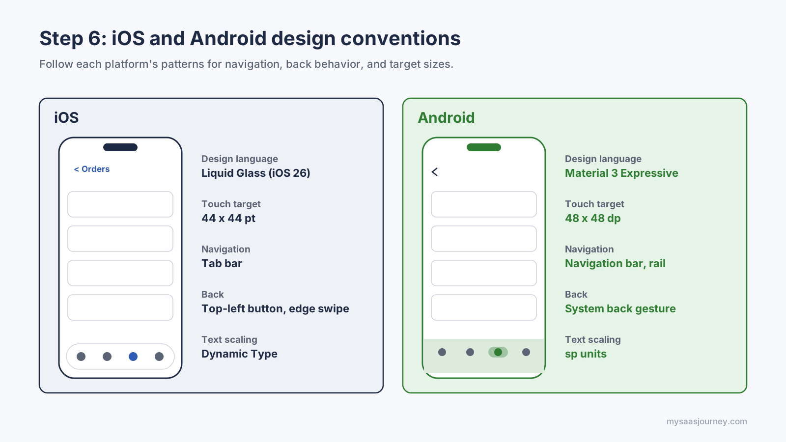
| Area | iOS (Human Interface Guidelines) | Android (Material Design) |
| Current design language | Liquid Glass, introduced with iOS 26 in 2025 | Material 3, with the Material 3 Expressive update in 2025 |
| Size unit | Points (pt) | Density-independent pixels (dp), and sp for text |
| Minimum touch target | 44 by 44 pt | 48 by 48 dp |
| Primary navigation | Tab bar at the bottom | Navigation bar at the bottom, navigation rail on large screens |
| Going back | Back button in the top bar and swipe from the left edge | System back gesture or button |
| System font | San Francisco (SF Pro) | Roboto, or a brand font through Material theming |
| Screen edges | Respect safe areas around the Dynamic Island, notch, and home indicator | Draw edge-to-edge and pad content for system bars |
| Text scaling | Dynamic Type text styles | Scalable sp units and system font size |
Follow each platform’s patterns for navigation, back behavior, and target sizes.
What Liquid Glass and Material 3 Expressive Change
Apple announced Liquid Glass on June 9, 2025. It makes controls such as tab bars, toolbars, and sheets translucent so they reflect and refract the content behind them and adjust between light and dark to keep text legible. If you use standard system components, your app picks up the new look automatically. Custom controls need testing over busy backgrounds, and you should check legibility with the system’s transparency and contrast settings turned on.
Material 3 Expressive adds more color, shape variety, and motion to Google’s design system, with the goal of making key actions easier to spot. As with iOS, standard components inherit most changes, so build on platform components wherever you can.
Native Look or One Shared Design?
Cross-platform frameworks such as Flutter and React Native let one codebase serve both platforms. You still need to decide whether the app should look identical everywhere or adapt to each platform. A practical middle path is a shared brand layer (colors, type, illustrations) on top of platform-specific navigation, back behavior, and system controls. Users notice a non-native back gesture far more than a custom button color.
If you plan to build without a large engineering team, no-code tools and low-code platforms can turn designs into working apps, though they limit how far you can customize platform behavior.
Step 7: Design for Accessibility From the Start
Accessible design makes your app usable by people with low vision, color blindness, motor limitations, hearing loss, and cognitive differences, and it improves the experience for everyone else in bright sunlight, on the move, or one-handed. It is also a legal requirement in more markets. Since June 28, 2025, the European Accessibility Act has required many consumer products and services sold in the EU, including e-commerce, banking, transport, and e-book apps, to meet the EN 301 549 standard, which references the Web Content Accessibility Guidelines (WCAG). Very small service businesses with fewer than 10 employees and no more than 2 million euros in annual turnover are exempt.
Follow the Core Accessibility Rules
| Requirement | Target | WCAG reference |
| Text contrast | At least 4.5:1, or 3:1 for large text | 1.4.3 Contrast (Minimum), level AA |
| Icon, border, and control contrast | At least 3:1 against adjacent colors | 1.4.11 Non-text Contrast, level AA |
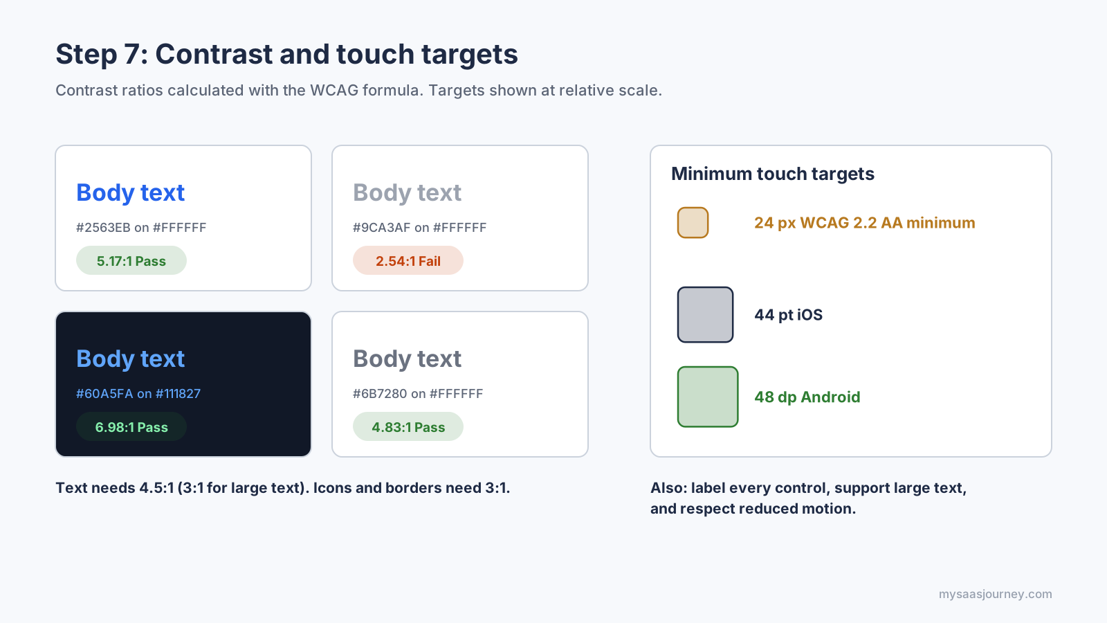
| Touch target size | At least 24 by 24 CSS pixels (use the platform minimums of 44 pt and 48 dp) | 2.5.8 Target Size (Minimum), level AA in WCAG 2.2 |
| Text resizing | Layout still works when text is enlarged to 200% | 1.4.4 Resize Text, level AA |
| Color alone | Never the only way to show status or errors | 1.4.1 Use of Color, level A |
| Labels | Every control has a name a screen reader can announce | 4.1.2 Name, Role, Value, level A |
| Motion | Animation can be reduced or turned off | 2.3.3 Animation from Interactions, level AAA (recommended) |
Check contrast with the WCAG formula and size targets for real fingers.
Check Color Contrast in Code
Design tools include contrast checkers, but it helps to understand the math, especially if you generate themes automatically. WCAG calculates the relative luminance of each color and compares them:
The light gray in that example is a common trap. It looks elegant in a mockup but fails for placeholder and helper text. Run every text and background pair in your token file through a check like this one, including dark mode pairs.
Label Everything for Screen Readers
VoiceOver on iOS and TalkBack on Android read out the names of controls. Icon-only buttons need explicit labels, and decorative images should be hidden from assistive technology. In code, that looks like this:
Add the label text to your design specs so developers do not have to invent it. Also annotate the reading order of each screen and which elements should be grouped, such as a product card that should read as one item.
Test With Real Settings
Before handoff, review your designs at the largest system text size, in dark mode, with a color blindness simulator, and with reduced motion and increased contrast turned on. Then test the built app with VoiceOver and TalkBack. A short pass with these settings catches most accessibility problems early, when they are cheap to fix.
Step 8: Design Responsive Layouts, Dark Mode, and Every Screen State
A real app runs on small phones, large phones, foldables, and tablets, in light and dark mode, with good data, no data, and broken connections. Designing only the ideal screen on one device is the most common reason apps look unfinished once they ship.
Plan Layouts by Window Size
Design for window size classes rather than individual devices. Material Design defines three main width classes, and they work well as a planning tool on any platform:
| Width class | Window width | Typical devices | Layout approach |
| Compact | Under 600 dp | Phones in portrait | Single column, bottom navigation |
| Medium | 600 to 839 dp | Foldables, small tablets, phones in landscape | Two panes or wider cards, navigation rail |
| Expanded | 840 dp and above | Tablets, desktops | List and detail side by side, navigation rail or drawer |
Plan layouts by width class rather than by individual device.
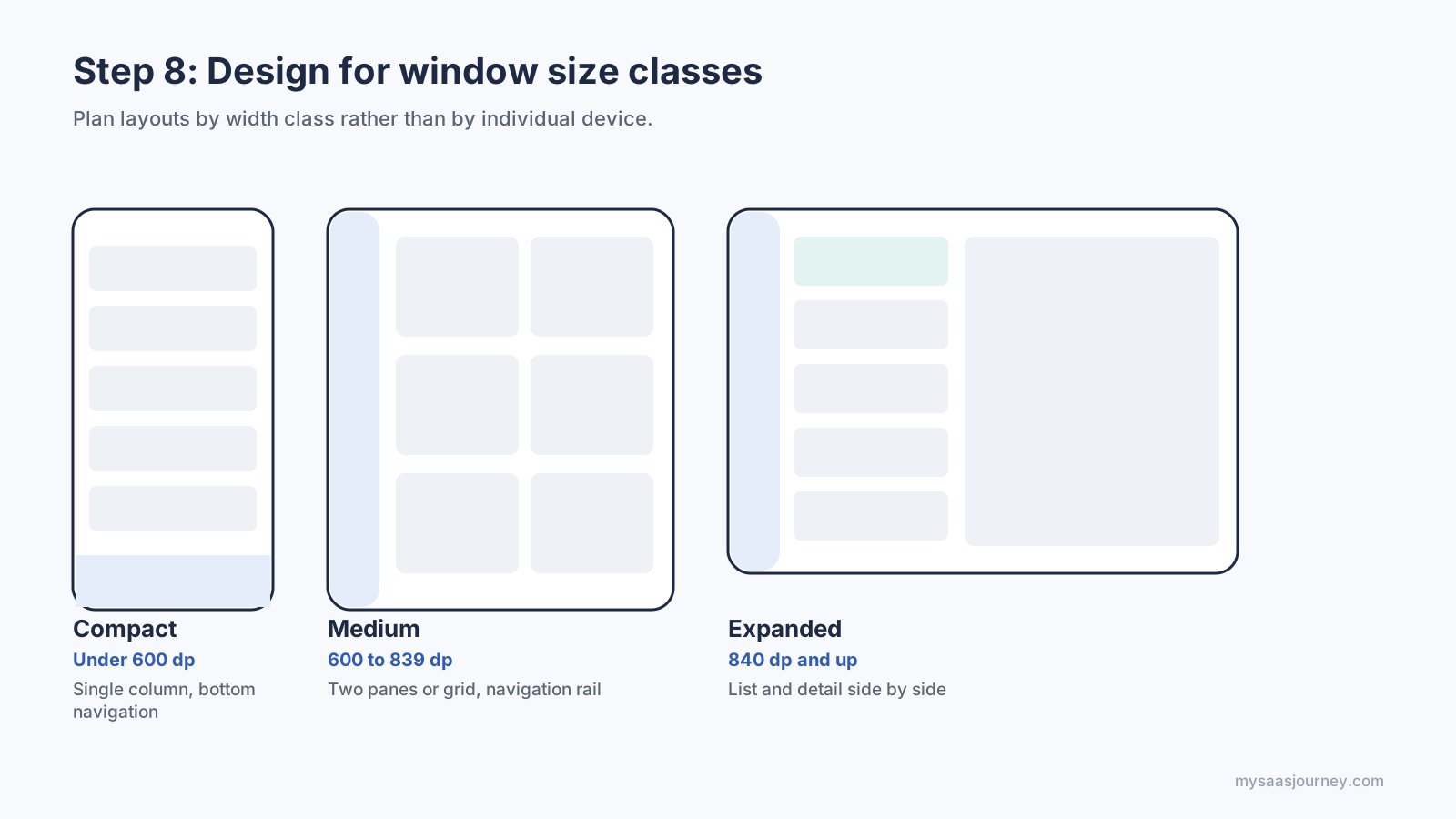
In Jetpack Compose, developers read the size class and switch layouts, so your designs should show each version:
Design Dark Mode With Semantic Tokens
Dark mode is not an inverted light theme. Use dark gray rather than pure black for large surfaces, reduce the saturation of bright brand colors, and show elevation by making raised surfaces slightly lighter instead of relying on shadows. If your colors are semantic tokens, dark mode is mostly a matter of remapping them:
Check contrast again for every dark mode pair. A brand blue that passes on white often fails on a dark surface, which is why the dark theme above uses a lighter blue.
Design Every Screen State
Each screen that shows data can be in at least five states. Design all of them before handoff:
- Empty: No data yet. Explain what will appear and offer the first action, such as “Add your first project.”
- Loading: Use skeleton placeholders that match the final layout, so the screen does not jump when content arrives.
- Partial: Only some data is available, such as one item in a list built for many.
- Error: Say what happened in plain language and offer a way forward, such as “Retry” or “Work offline.”
- Ideal: The full, populated screen most mockups show.
Design all five states before handoff.
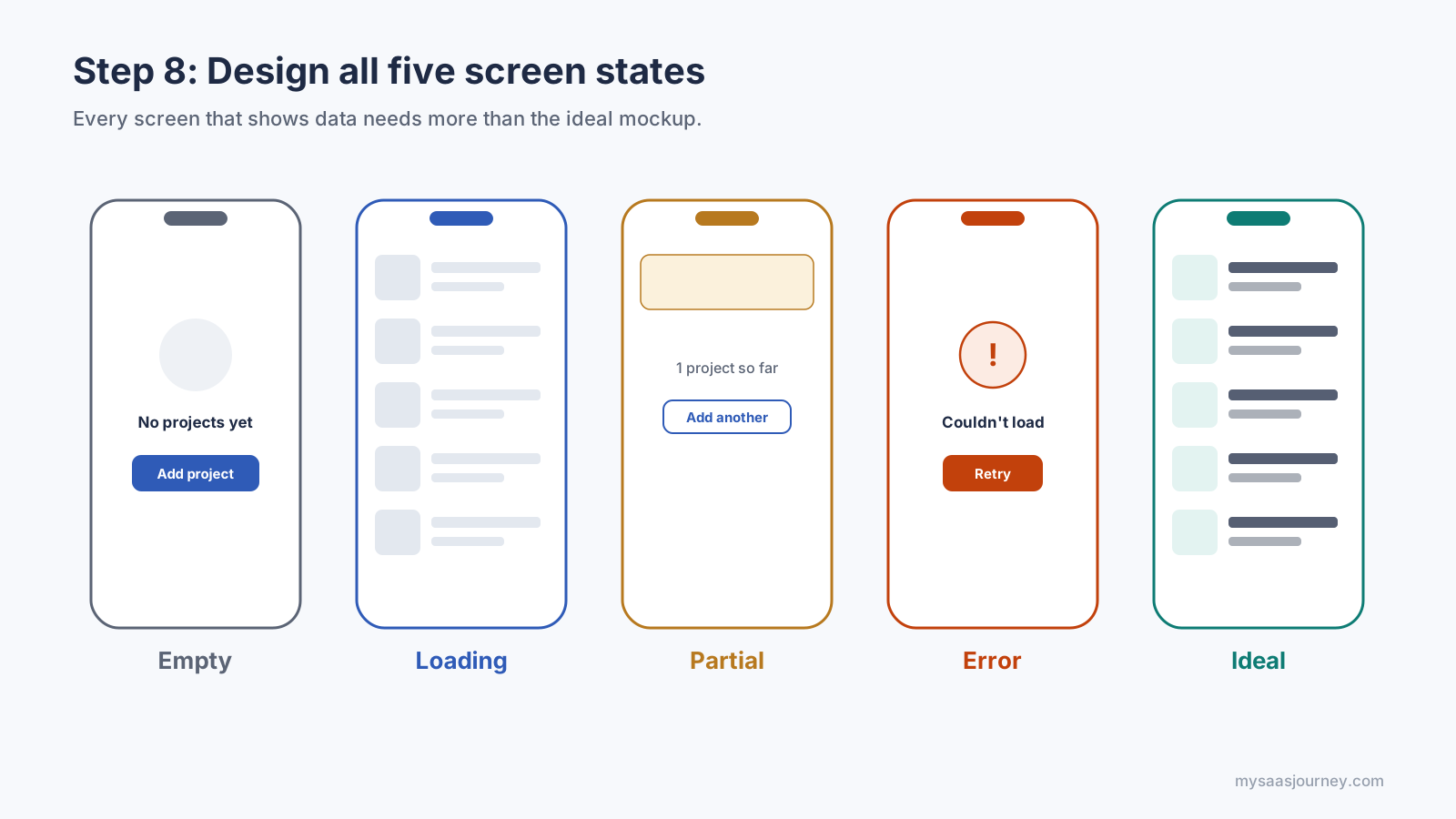
Add offline behavior, long text, very long names, right-to-left languages if you plan to localize, and permission prompts to the same checklist. These edge cases are where users decide whether an app feels trustworthy.
Step 9: Prototype the Experience and Add Motion
A prototype links your screens so people can tap through them as if the app were real. It is the fastest way to find out whether your flows make sense, long before any code exists.
Choose the Right Prototype Fidelity
- Clickable wireframe prototype: Links gray wireframes together. Use it to test navigation and flow order.
- High-fidelity prototype: Uses final visuals, real copy, and realistic data. Use it to test comprehension, trust, and visual hierarchy.
- Coded prototype: A rough build in a real framework, or a working version from an AI coding tool. Use it when gestures, performance, sensors, or real data matter to the test.
Prototype only the flows you plan to test. A prototype that links every screen takes longer to build and rarely gets fully used.
Use Motion to Explain, Not Decorate
Good motion shows where something came from, what changed, and what to do next. Keep these rules in mind:
- Keep it short. Small feedback, such as a button press or toggle, works best at around 100 to 200 milliseconds. Larger transitions between screens usually sit between about 250 and 500 milliseconds.
- Use easing. Elements should speed up and slow down naturally rather than move at a constant speed. Entering elements decelerate, and exiting elements accelerate.
- Keep motion consistent. The same action should always animate the same way, so define motion tokens for durations and easing curves alongside your color and spacing tokens.
- Respect reduced motion. Some people experience dizziness or nausea from large movements. When the system setting is on, replace sliding and zooming with simple fades or no animation.
Reduced motion is easy to support when developers know to check for it:
Note the reduced-motion behavior in your specs for each animated element, so it is designed rather than left to chance.
Step 10: Test Your Design With Real Users
Usability testing means watching real people try to complete tasks with your prototype and noting where they struggle. It is the single most reliable way to improve a design, because users reveal problems the team has stopped seeing.
Plan Small, Frequent Rounds
You do not need a large sample to find most usability problems. Jakob Nielsen’s widely cited analysis found that testing with about five users uncovers most of the problems in a design, and that several small rounds beat one large one. Test with five people, fix what you find, and test again.
Small, repeated rounds find more problems than one big study.
Write Realistic Tasks
Give participants goals, not instructions. “You want to reorder the shoes you bought last month” tests your design. “Tap the Orders tab, then tap Reorder” only tests whether people can follow directions. Ask participants to think aloud as they work, and resist the urge to help.
Choose a Testing Method
| Method | How it works | Best for |
| Moderated remote or in-person test | A facilitator watches and asks follow-up questions | Early prototypes, understanding why people struggle |
| Unmoderated remote test | Participants record themselves completing tasks alone | Quick feedback from more people, later-stage designs |
| First-click test | Participants show where they would tap first | Navigation labels and screen layout |
| Five-second test | Participants see a screen briefly, then describe it | Visual hierarchy and first impressions |
| A/B test | Two live versions are compared with real traffic | Fine-tuning a released app with enough users |
Measure the Results
Track the metrics you set in Step 1, especially task success rate, time on task, and errors. Many teams also use the System Usability Scale (SUS), a ten-question survey that produces a score from 0 to 100. Industry benchmarks often treat a score of about 68 as average, so a score well below that signals real friction.
After each round, list every issue, rate its severity (from cosmetic to blocking), and fix the most severe ones first. Then update the prototype and repeat.
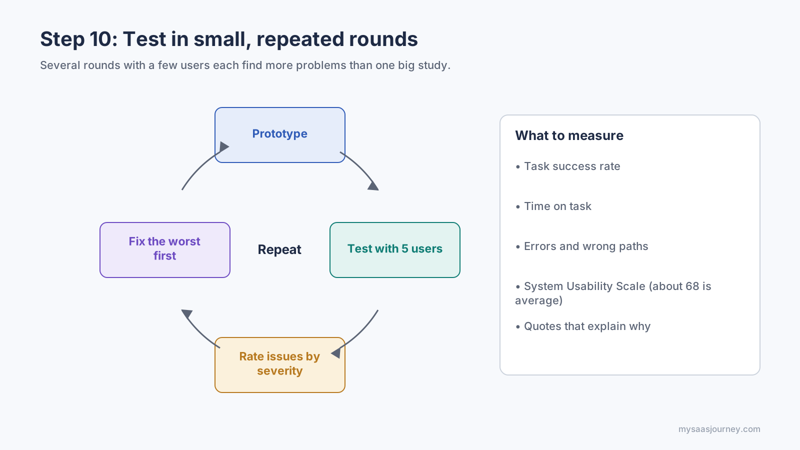
Step 11: Hand Off the Design to Developers
A good handoff gives developers everything they need to build the design exactly, without guessing. Treat it as an ongoing conversation rather than a single file drop, and involve developers from Step 3 onward so technical limits surface early.
What a Complete Handoff Includes
- Final screens for every state, including empty, loading, error, dark mode, and each window size class.
- Design tokens for color, type, spacing, radius, elevation, and motion, exported in a format the codebase can consume.
- Component specs with every state, the token each property uses, and notes on behavior.
- User flows that show how screens connect, including error and back paths.
- Interaction and motion notes, with durations, easing, and reduced-motion behavior.
- Accessibility annotations, including labels, reading order, focus order, and grouping.
- Assets such as icons in SVG or PDF vector format and images at the required resolutions.
- Copy, including error messages, empty-state text, and strings to be translated.
- Data requirements, noting which fields come from the server, which are optional, and how long they can be, so the API design matches the screens.
A complete handoff leaves developers nothing to guess.
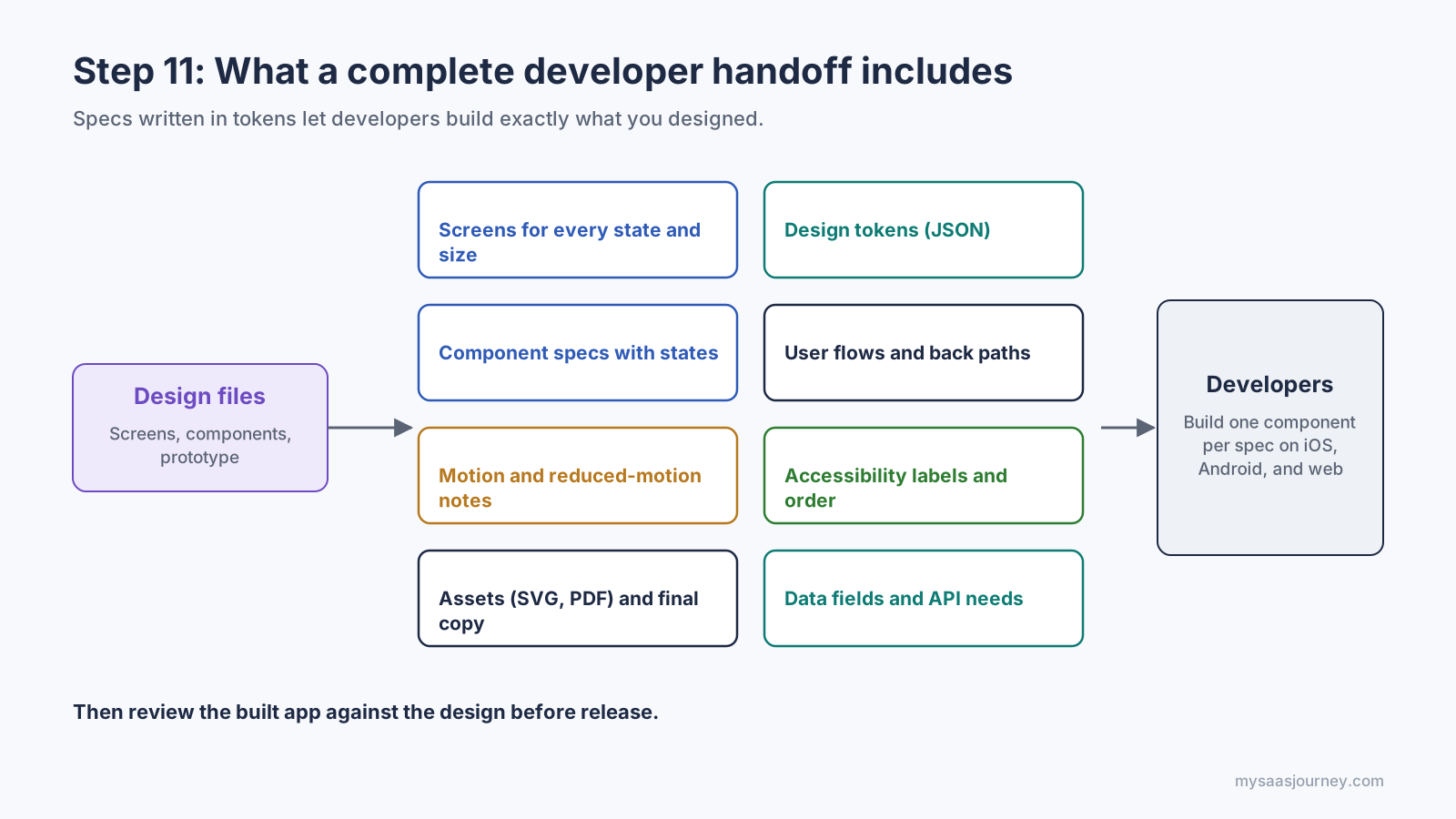
Spec Components in Tokens, Not Pixels
When a spec names tokens rather than raw values, developers can build one component that works across themes and platforms. Here is the same primary button built from one spec in SwiftUI and Jetpack Compose. Both use a 48-point or 48-dp minimum height, the color-action-primary token, a 12-unit corner radius, and a loading state.
In both examples, Tokens is generated from the same token file shown in Step 5. When the brand color changes, you update one value and both apps follow.
Track Design Work Alongside Development
Link each screen or component to the development ticket that implements it, and keep a short changelog when designs change after handoff. Whichever tracker your team uses, the comparison in our Jira vs Trello guide shows how teams organize this kind of work. Schedule a design review of the built app before release, because small spacing, state, and text-wrapping differences are easier to fix before users see them.
Step 12: Measure, Learn, and Iterate After Launch
Launch is the start of a new design cycle, not the end of the project. Real usage data shows where people drop off, which features they ignore, and what they try to do that the app does not support.
Plan Analytics Events During Design
Decide what to measure while you design, not after launch. Each key flow should have events for the start, each important step, success, and failure. Agree on a naming convention and the properties each event carries, so the data is consistent across iOS, Android, and web. A simple tracking plan can live in code as a typed schema:
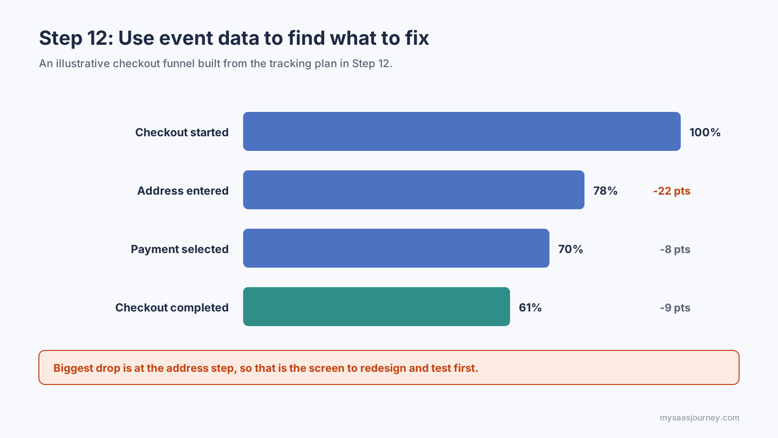
With events like these, you can build a funnel that shows exactly which step loses the most people, then design a fix for that step.
Event data shows which step to redesign first. Figures are illustrative.
Combine Numbers With Qualitative Signals
- Funnels and retention curves show where and when people leave.
- Session recordings and heatmaps show what people tried to do on a confusing screen, with personal data masked.
- App store reviews and support tickets describe problems in users’ own words.
- In-app surveys asked at the right moment, such as after a completed task, explain why.
Iterate in Small, Measured Changes
Pick one problem, form a hypothesis such as “Saving addresses by default will cut checkout drop-off at the address step,” design the change, and measure it against the metric you chose. If you have enough traffic, run an A/B test. If not, compare before and after over a fixed period and confirm with a few user sessions. Feed what you learn back into your design system, so every screen benefits from each fix.
What Tools Do You Need to Design an App?
You need one main interface design tool, plus a few specialist tools for research, prototyping, testing, and handoff. The examples below are grouped by job rather than ranked. Features and pricing change often, so confirm current details with each provider.
| Job | What the tool does | Examples |
| Interface design and prototyping | Wireframes, high-fidelity screens, components, clickable prototypes | Figma, Sketch (macOS), Penpot (open source) |
| Whiteboarding and research synthesis | Sketching, user flow mapping, affinity mapping | FigJam, Miro, and other online whiteboards |
| Advanced prototyping | Prototypes with sensors, variables, and complex gestures | ProtoPie, Framer |
| Motion and animation | Lightweight animations that ship inside the app | Lottie, Rive |
| Design tokens | Store tokens and export them to code | Tokens Studio, Style Dictionary |
| Usability testing | Remote tests, first-click tests, surveys | Maze, UserTesting, Lyssna |
| Accessibility checks | Contrast, screen reader, and target-size audits | Xcode Accessibility Inspector, Android Accessibility Scanner, contrast plugins |
| Graphics and assets | Illustrations, icons, marketing images | Vector editors and Canva alternatives |
Adobe XD, once a popular choice, is in maintenance mode. Adobe no longer sells it as a standalone app and provides only bug, security, and privacy fixes, so it is not a good starting point for a new project.
AI is also changing the early stages of app design. Many design tools can now generate draft layouts, copy, and placeholder images from a text prompt, and coding assistants can turn a design into a working prototype. These tools speed up exploration, but they do not replace research, flows, accessibility, or testing. Treat AI output as a first sketch that still needs the same review as anything else. Our roundup of the best AI tools covers options across categories.
What Are the Most Common App Design Mistakes?
Most app design mistakes come from skipping a step rather than from poor visual taste. Watch for these patterns:
| Mistake | Why it hurts | How to avoid it |
| Starting with visual design | Polished screens hide unclear flows and scope | Finish flows and wireframes before styling |
| Designing only the ideal state | Empty, loading, and error screens look broken at launch | Design all five screen states for each data screen |
| Too many features in version one | Core tasks get buried and the build runs late | Use MoSCoW scoping and protect the MVP |
| Ignoring platform conventions | Back behavior and navigation feel wrong to users | Follow the HIG and Material Design for system patterns |
| Low-contrast text and tiny targets | Hard to read outdoors and fails accessibility rules | Check contrast in code and use 44 pt or 48 dp targets |
| Asking for permissions on launch | Users deny location or notifications without context | Ask at the moment the feature needs it, with a short explanation |
| Long sign-up before any value | Many users leave before seeing what the app does | Let people explore first, and ask for an account when it is needed |
| One-off styles everywhere | Inconsistent screens and slow development | Use tokens and components for every screen |
| Testing too late | Problems are found after code is written | Test clickable prototypes in small rounds from Step 9 |
| No analytics plan | Teams guess at what to fix after launch | Define events for each key flow during design |
If you only have time to fix one thing, fix the core flow. A user who completes the main task easily will forgive rough edges elsewhere. A user who cannot complete it will not come back.
App Design Glossary
- UX (user experience) design: Designing how an app works and how easily people complete their tasks.
- UI (user interface) design: Designing the visual layer, including layout, type, color, and components.
- User flow: A diagram of the steps a person takes to complete one task.
- Information architecture (IA): How screens and content are grouped, labeled, and connected.
- Wireframe: A simplified, unstyled layout of a screen.
- Prototype: A linked set of screens that people can tap through to test a design.
- Design system: A shared library of tokens, components, and usage rules.
- Design token: A named value, such as a color or spacing size, used in both design files and code.
- Component: A reusable interface element, such as a button or text field, with defined states.
- Point (pt) and density-independent pixel (dp): Platform units that keep sizes consistent across screen densities on iOS and Android.
- Safe area: The part of the screen not covered by system elements such as the notch, Dynamic Island, or home indicator.
- Window size class: A width category, such as compact, medium, or expanded, used to adapt layouts.
- WCAG: The Web Content Accessibility Guidelines, the main international standard for digital accessibility.
- MVP (minimum viable product): The smallest version of an app that still solves the core problem.
- Handoff: The process of giving developers the specs, tokens, and assets they need to build a design.
Frequently Asked Questions
How do I design an app with no design experience?
Start with the problem and the core user flow, not the visuals. Sketch screens on paper, rebuild them in a design tool using its built-in component kits for iOS or Android, and test a clickable prototype with five people. Platform kits and design systems give you sensible defaults while you learn.
Do I need to know how to code to design an app?
You do not need to code to design an app. Understanding the basics of how layouts, components, and states are built in code helps you design things developers can build, and design tokens make that link explicit.
What is the difference between UI and UX design?
UX design decides how the app works, including the flows, structure, and ease of completing tasks. UI design decides how it looks, including layout, type, color, and components. Good app design needs both, and in small teams one person often does both.
How long does it take to design an app?
It depends on the app’s scope. A simple app with a few core flows can move from research to tested high-fidelity designs in a few weeks, while a complex product with many roles and platforms can take several months. Design also continues after launch.
What screen size should I design my app for?
Design for a common phone size first, such as a 390 by 844 point frame for iPhone or a 360 by 800 dp frame for Android, then check smaller and larger phones, landscape, and tablets. Use window size classes rather than one fixed device size.
Should I design for iOS or Android first?
Design first for the platform most of your target users have, which varies by country and audience. Keep a shared brand layer, then adapt navigation, back behavior, and system controls for the second platform rather than copying screens across unchanged.
How many screens does an app need?
As few as your core flows require. Map the flows first and count the screens they need. Keep the first version to the screens those flows need, and treat empty, loading, and error states as variations of each screen rather than separate screens.
Can I design an app for free?
Yes, several design tools offer free plans or are open source, and both Apple and Google publish free design guidelines and component kits. Paid plans mainly add team collaboration, larger libraries, and advanced handoff features.
Can AI design an app for me?
AI tools can generate draft screens, copy, and even working prototypes from a prompt, which speeds up early exploration. They do not know your users, your edge cases, or your accessibility needs, so you still need research, flows, testing, and review.
How do I make my app accessible?
Meet WCAG contrast ratios of 4.5:1 for normal text, use touch targets of at least 44 pt on iOS and 48 dp on Android, support system text sizes and reduced motion, never use color alone to convey meaning, and label every control for VoiceOver and TalkBack.
What should I give developers at handoff?
Give them final screens for every state and size, design tokens, component specs with states, user flows, motion and accessibility notes, assets, final copy, and the data each screen needs. Stay available for questions and review the built app before release.
Summary
Designing an app is a sequence of decisions that build on each other. Define the problem, users, and success metrics. Research real needs and existing apps. Map user flows and information architecture before drawing screens. Wireframe on a grid, then turn your visual decisions into design tokens and components that both designers and developers can use. Follow iOS and Android conventions, meet WCAG accessibility targets, and design every screen state, size, and theme. Prototype, test with five users at a time, hand off specs written in tokens, and keep measuring after launch.
The tools and trends keep changing, from Liquid Glass and Material 3 Expressive to AI-generated layouts, but the process stays the same. Apps that start from a clear problem and a tested core flow are the ones people keep using. To explore software that supports each stage, browse our productivity software category.